Sarah Peters Campaign Collateral
Brand, Responsive Website + Mailer Design
A brand to match a different kind of candidate
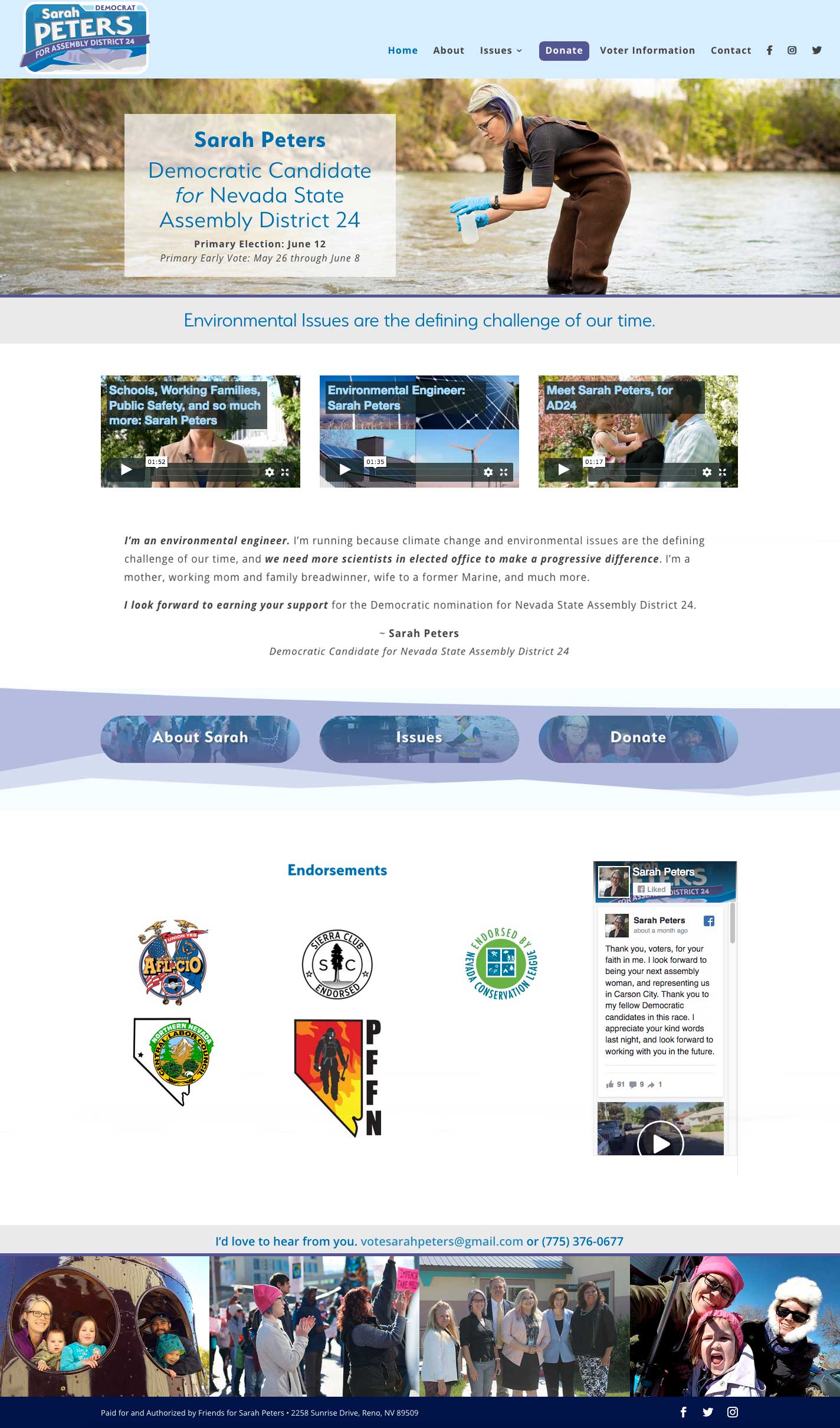
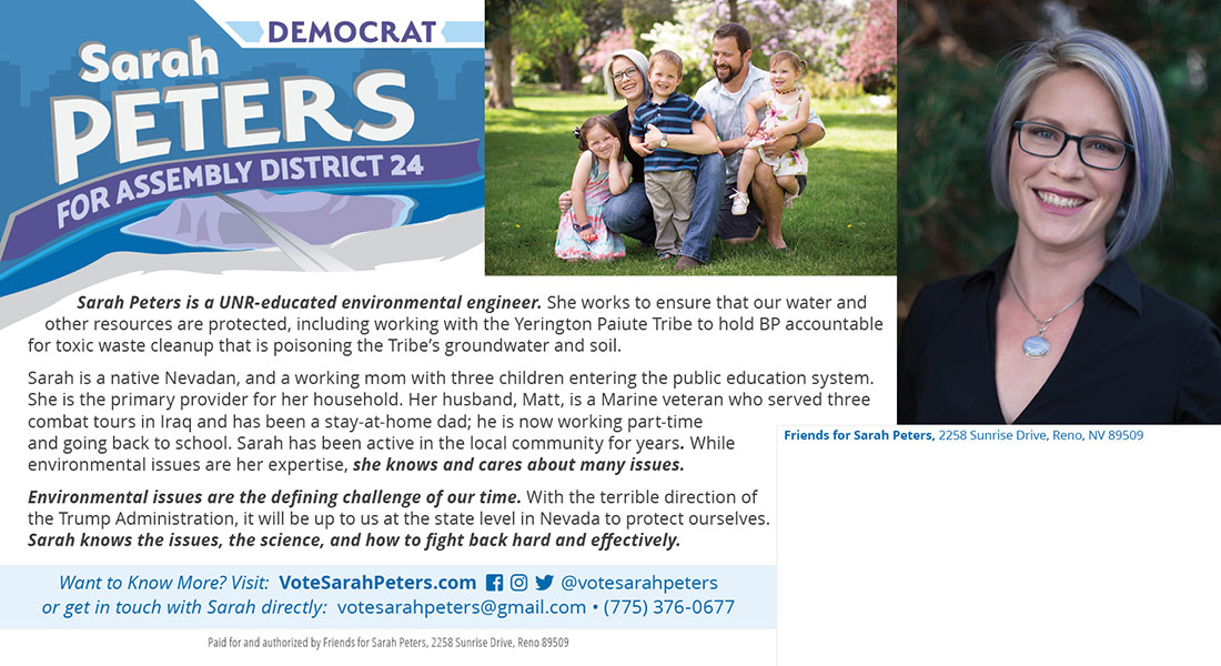
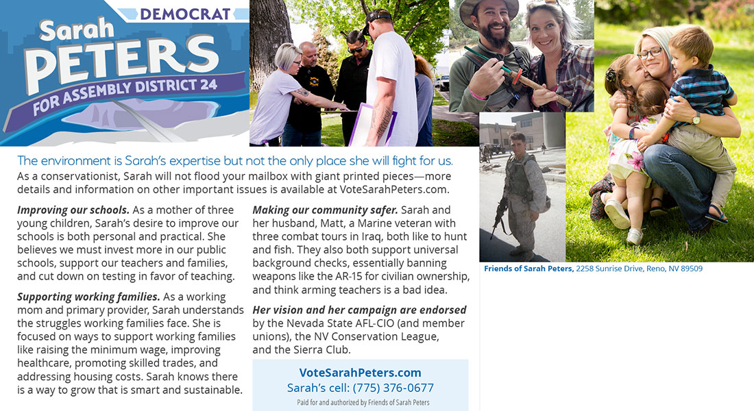
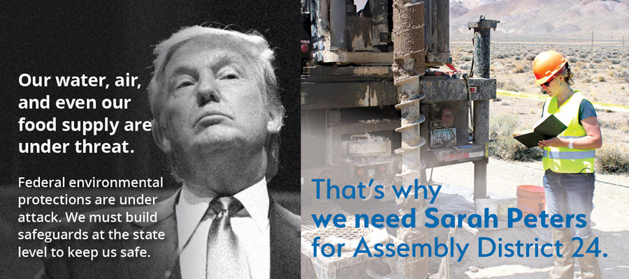
Sarah Peters decided she wanted to run for office. Her assembly district was unexpectedly open, and she’d always wanted to serve. Sarah was/is a different kind of candidate. She’s young, outspoken, an environmental engineer, has purple hair and has several tattoos. Since her district is the most progressive in the area, we knew that leaning into her differences was the way to get her message out there. In addition to this, she was going up against two candidates, one who was endorsed by the democratic caucus and another who had owned a business in the district for 35+ years. She/we had our work cutout for us.
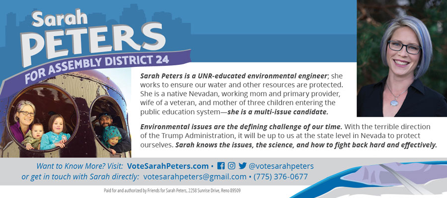
Since she was a first time candidate, she needed everything, logo, signs, website, walkcards, mailers, etc. When it came to designing her brand, I knew she needed something different. In order to win, she had to run a different campaign, starting with a different look. Her logo, signs, etc., needed to match who she was and stand out from the crowd of red, white and blue name-in-all-caps-with-a-star-somewhere signs out there.
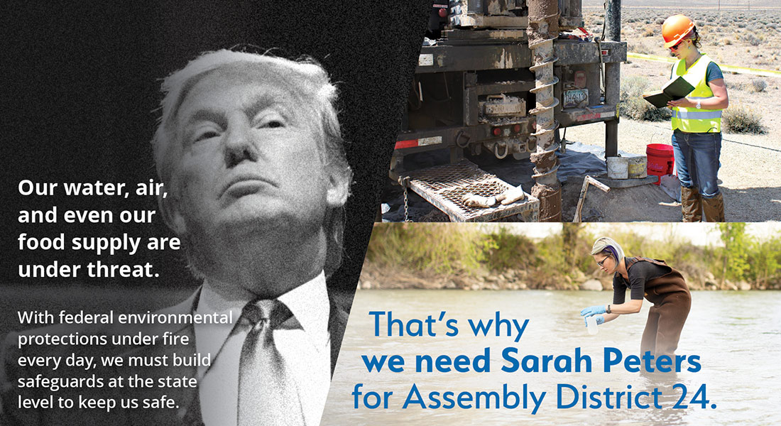
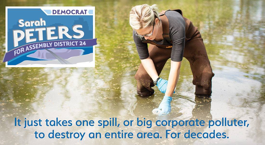
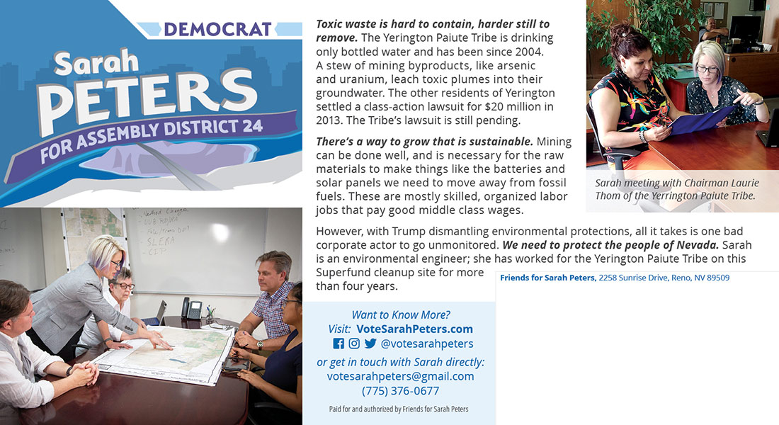
The Truckee River runs right through the middle of her district in Reno, NV. At the center of this portion of the Truckee is Wingfield Park a meeting place where you will see all ages and ethnic and socioeconomic backgrounds represented. This was the perfect symbol for her campaign—combining the environmental dedication with representing the whole district. Then came the task of incorporating it into the logo/sign. I chose to mimic the vintage National Parks poster designs, using her signature purple and blue. It took some tweaking to get it just right, but in the end, we had a sign that many people remembered and jumping off place for framing the campaign.
Pieces created:
- Logo
- Business cards, letterhead and envelopes
- Walkcards
- Yard/street signs
- Website
- 3 Mailers
Printed Collateral for Voter Outreach

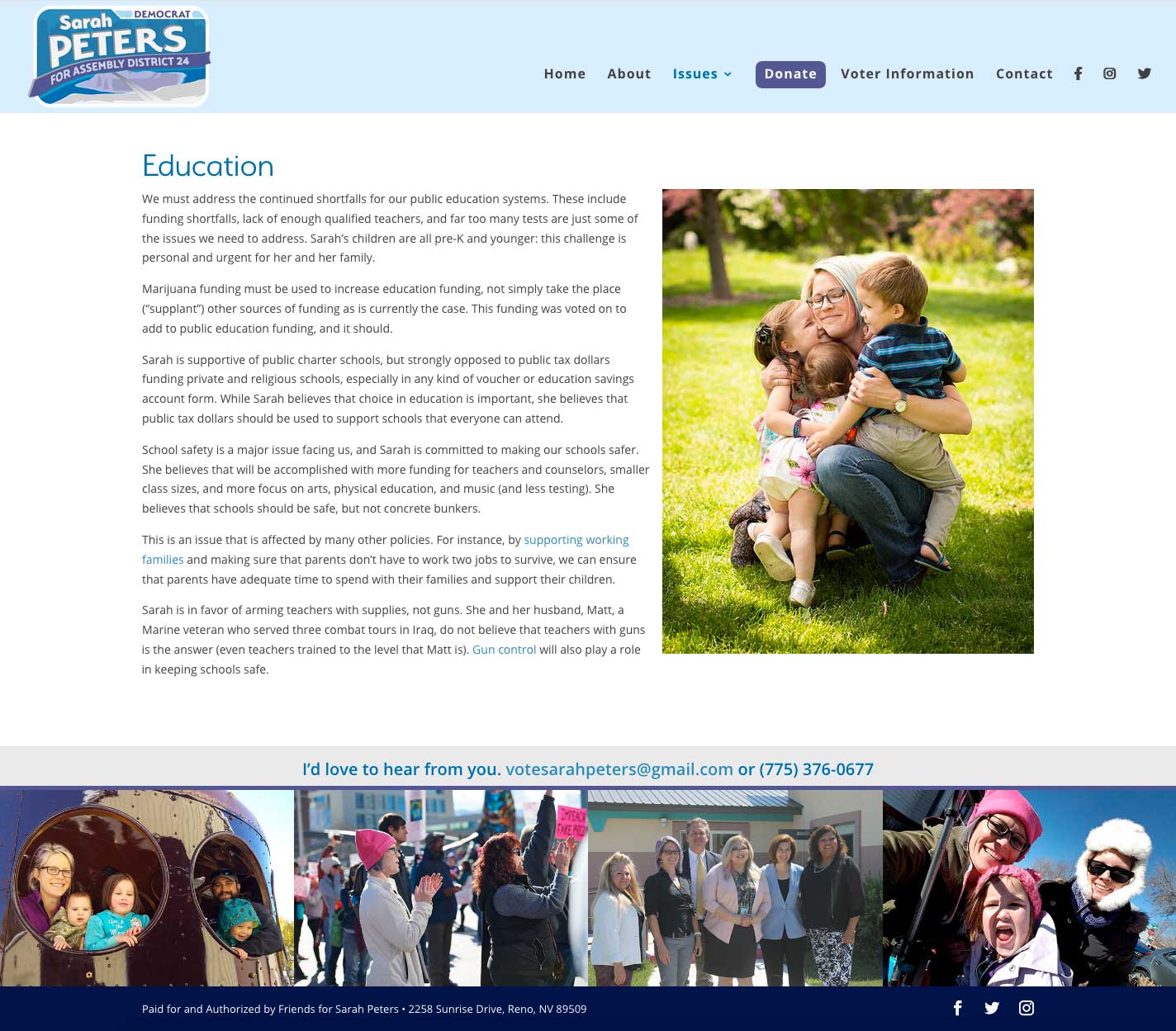
Website pages